Category: Uncategorized
New logos for three MLB teams
The landscape of baseball is dramatically changing. The Astros are moving to the AL in 2013 to make it an even fifteen clubs in each league. There will be an extra playoff team in each league as well, starting as soon as next season. In the new format, two wildcard teams will battle each other in a one-game playoff for the chance to play the number one seed. This puts even more emphasis on winning your division, something which the AL East has become less and less concerned with. Finally, three teams have undergone drastic changes in their logos and uniforms. Check it out:
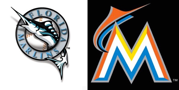
First off, the newly branded Miami Marlins. The logo on the left is of the classic Florida Marlins, the one on the right is for 2012 and beyond.
Second comes the Toronto Blue Jays. The Jays have gone through several logo changes over the past few decades, including three different logos in three years. Toronto’s new logo, on the far right, is an homage back to the franchise’s first bird.
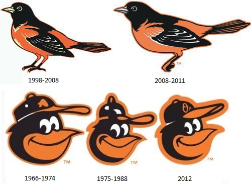
Finally we have the Baltimore Orioles. The O’s have undergone numerous logo changes since the franchise moved to Maryland in 1954. The ornithological bird from 1998 was updated to be more stout, majestic, and modern in 2008. Now, much like Toronto, they are reverting back to their old days and going back to the ‘cartoon bird.’ The 2012 logo is a mix of two previous designs…
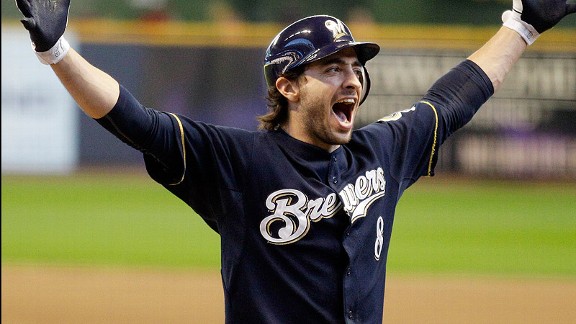
Baseball is surely changing, but you’ve gotta believe that it’s for the better. In Bud We Trust, right? He’s a UW-Madison grad, so he’s cool in my book. Oh and in case you haven’t heard, RYAN BRAUN was named the 2011 NL MVP.
Milwaukee holds 4.5 game lead with 6 games left
That’s what we’re dealing with here. And as they say, 3 is the magic number.
Oh, and Ryan Braun is tied with Jose Reyes for the NL batting title.


